Designing Impact: How our redesign played a key role in UPS’s decision to become our third client.
Designing Impact: How our redesign played a key role in UPS’s decision to become our third client.

All credit goes to our team for the raw prototype that secured our pre-seed investment. However, my problem-solving skills and UI refinements were crucial in elevating the platform, impacting the seed round, and securing the deal with UPS(United Parcel Service).
All credit goes to our team for the raw prototype that secured our pre-seed investment. However, my problem-solving skills and UI refinements were crucial in elevating the platform, impacting the seed round, and securing the deal with UPS(United Parcel Service).
Team
Solo Designer with guidance from a Product Manager and two developers.
Solo Designer with guidance from a Product Manager and two developers.
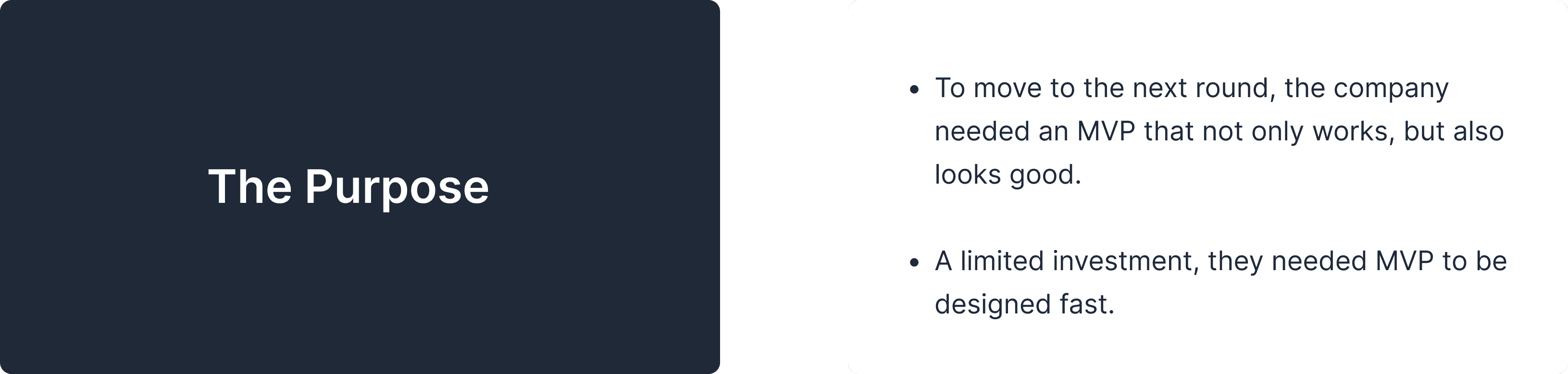


To make this Data Mapping Table neat and presentable these are the pointer needed to be taken care of:
To make this Data Mapping Table neat and presentable these are the pointer needed to be taken care of:
->
Provide user freedom to add and delete column.
Provide user freedom to add and delete column.
->
User should be able to edit/map the name based on the connectors library that assigned with the another name in some connector list.
User should be able to edit/map the name based on the connectors library that assigned with the another name in some connector list.
->
Make it self-explanatory.
Make it self-explanatory.
->
Add description.
Add description.
->
User can add max 10 column at one time.
User can add max 10 column at one time.
->
Make the end solution look more modern and simple than the initial version.
Make the end solution look more modern and simple than the initial version.
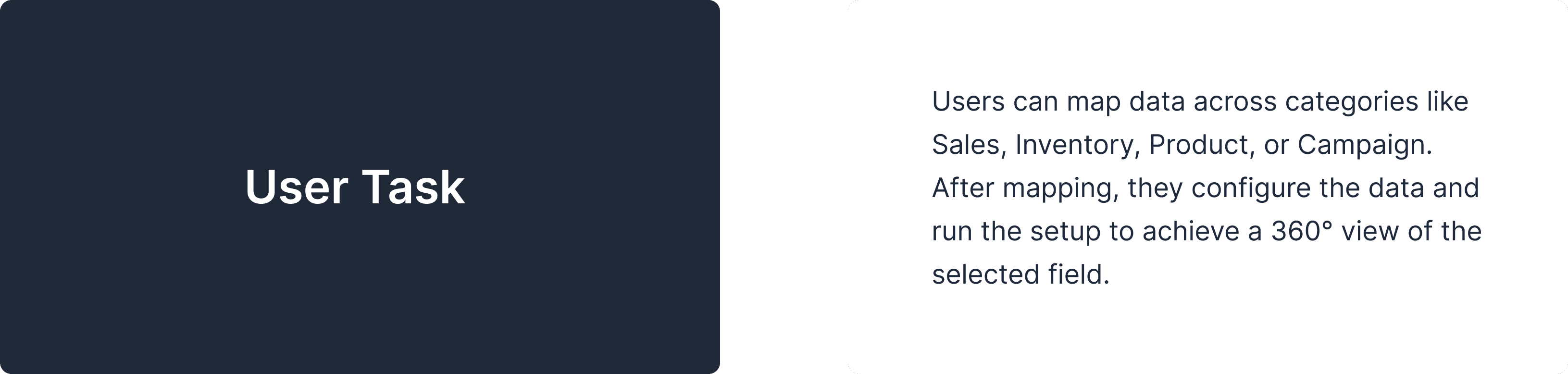


This is how the redesign process looked like
This is how the redesign process looked like
Step 1: Going into details
Step 1: Going into details
I started with a deconstruction of the ProfitOps app to understand user flows, and user flows — into separate data blocks, cards and tables. All to understand the role and meaning of every single design element.
I started with a deconstruction of the ProfitOps app to understand user flows, and user flows — into separate data blocks, cards and tables. All to understand the role and meaning of every single design element.
I started with a deconstruction of the ProfitOps app to understand user flows, and user flows - into separate data blocks, cards and tables. All to understand the role and meaning of every single design element.

An example of one screen deconstructed
An example of one screen deconstructed
Step 2: Heuristic evaluation to find out the area of improvement
Step 2: Heuristic evaluation to find out the area of improvement
The next move is to uncover user experience problems by research and analysis using Jakob Nielsen’s ten usability heuristics. Below, you can see several details investigated together with comments on problems.
The next move is to uncover user experience problems by research and analysis using Jakob Nielsen’s ten usability heuristics. Below, you can see several details investigated together with comments on problems.

A fragment of UX audit
A fragment of UX audit
Ideation inspiration from existing reference
Ideation inspiration from existing reference
For that I went through several article, you tube videos and visual inspiration because for platform we want to design something through which user is already familiar instead of something fancy. At the same time it should provide ease and happy user experience while performing task.
For that I went through several article, you tube videos and visual inspiration because for platform we want to design something through which user is already familiar instead of something fancy. At the same time it should provide ease and happy user experience while performing task.

Familiar UI for ‘Add Data Column’ and ‘Data Blend’ across different tools.
Familiar UI for ‘Add Data Column’ and ‘Data Blend’ across different tools.

While I was looking for some idea, I realised its already in front of me. Yes, Google , the most used platform , “Add new tab” became my inspiration for adding new column in data table.
While I was looking for some idea, I realised its already in front of me. Yes, Google , the most used platform , “Add new tab” became my inspiration for adding new column in data table.

Step 3: Wireframing
Step 3: Wireframing
To establish a foundation for a consistent UI, we decided to create a basic design system that we are gradually updating and expanding as needed.
To establish a foundation for a consistent UI, we decided to create a basic design system that we are gradually updating and expanding as needed.
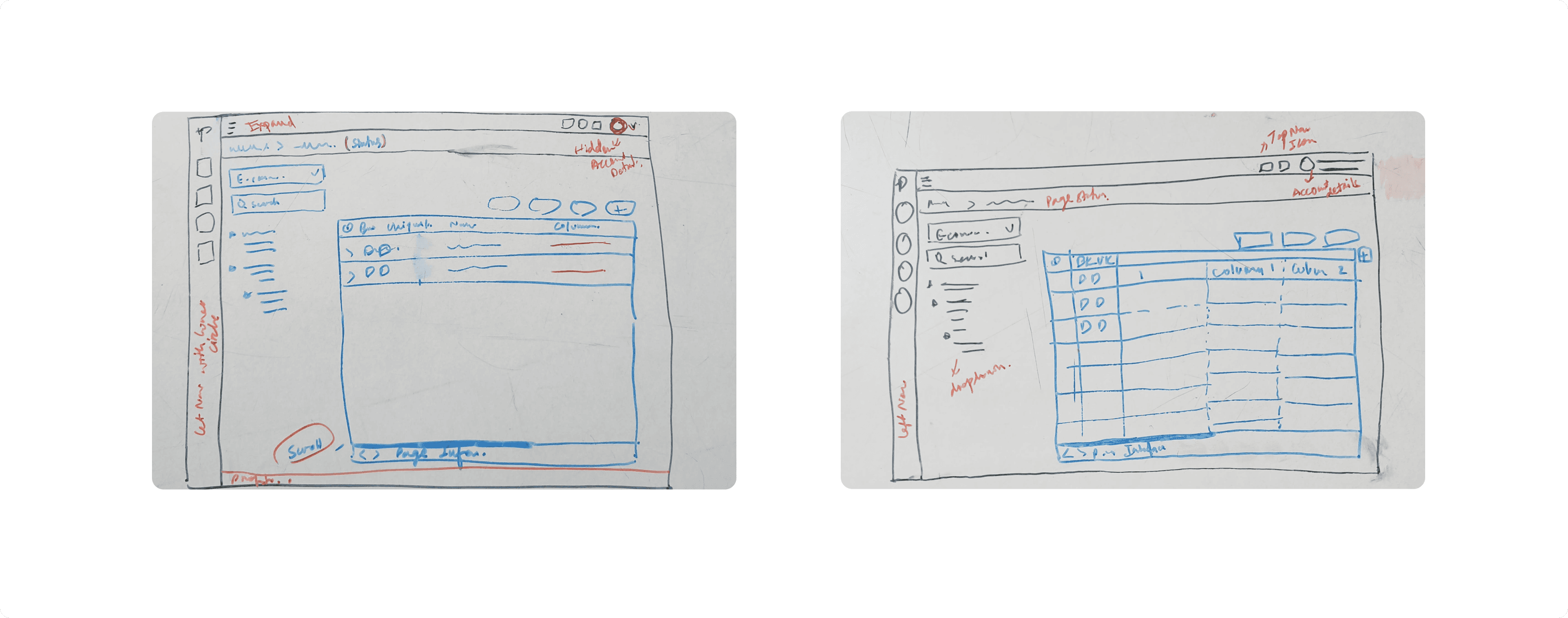
An example of low-fidelity wireframes
An example of low-fidelity wireframes
Step 4: Doing visual design
Step 4: Doing visual design
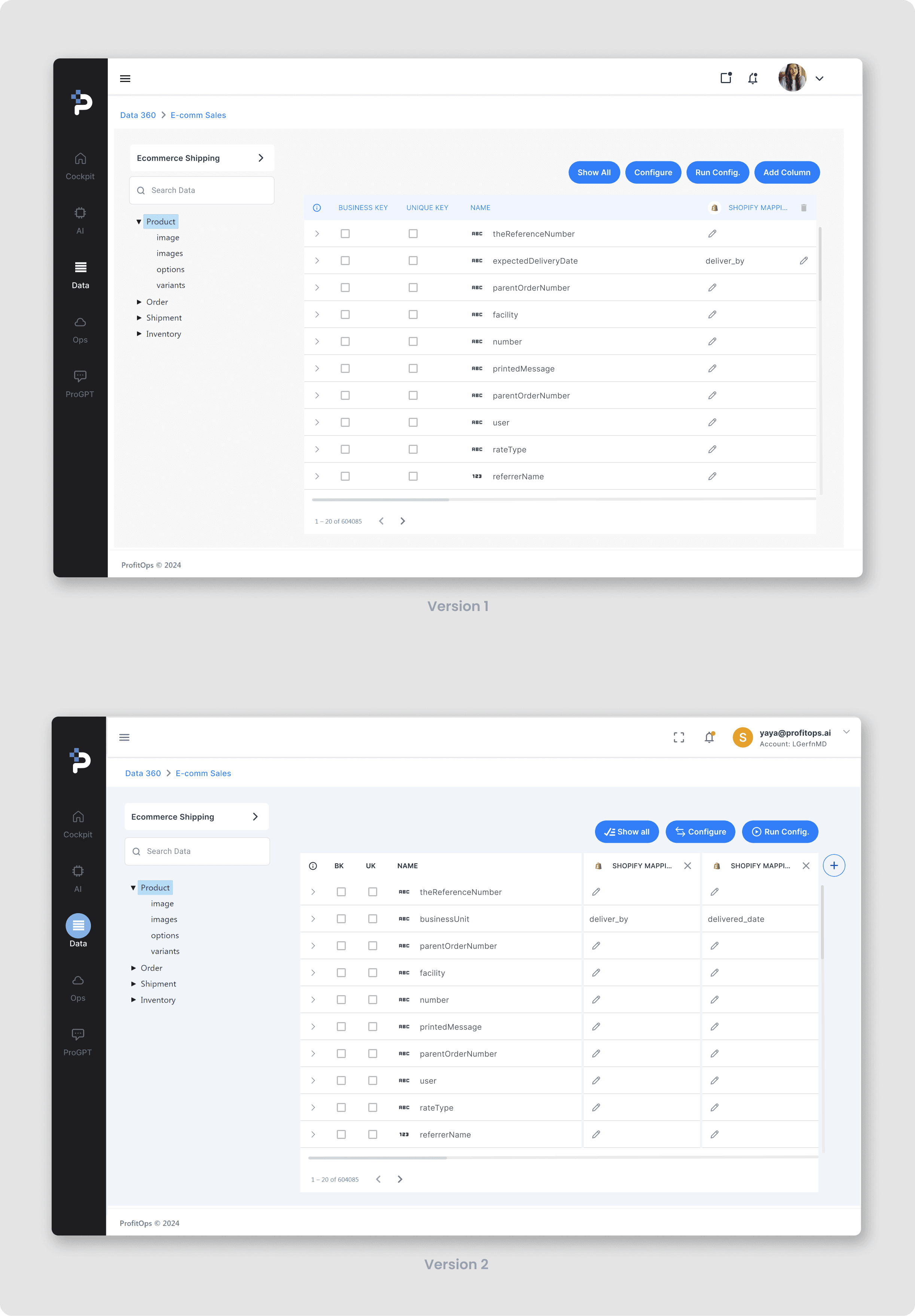
After analyzing both the option we had discussion over finalizing the one. Ended up thinking do we really need all the information which is shown on these version?
After analyzing both the option we had discussion over finalizing the one. Ended up thinking do we really need all the information which is shown on these version?
Step 4: Doing visual design
After analyzing both the option we had discussion over finalizing the one. Ended up thinking do we really need all the information which is shown on these version?
Why we choose version 2 over version 1 ?
Why we choose version 2 over version 1 ?
->
In version 2 Although the column added but we want to make it look seperate from rest of the details which is in column one.
In version 2 Although the column added but we want to make it look seperate from rest of the details which is in column one.
->
Headline in the entire app in data table not separated by blue color. To maintain that consistency we wanted to have in white background.
Headline in the entire app in data table not separated by blue color. To maintain that consistency we wanted to have in white background.
->
Highlighted left navigation button.
Highlighted left navigation button.
->
Description of Account details if they have more than one account with respective account ID.
Description of Account details if they have more than one account with respective account ID.
Step 5: Design System
Step 5: Design System
To establish a foundation for a consistent UI, we decided to create a basic design system that we are gradually updating and expanding as needed.
To establish a foundation for a consistent UI, we decided to create a basic design system that we are gradually updating and expanding as needed.
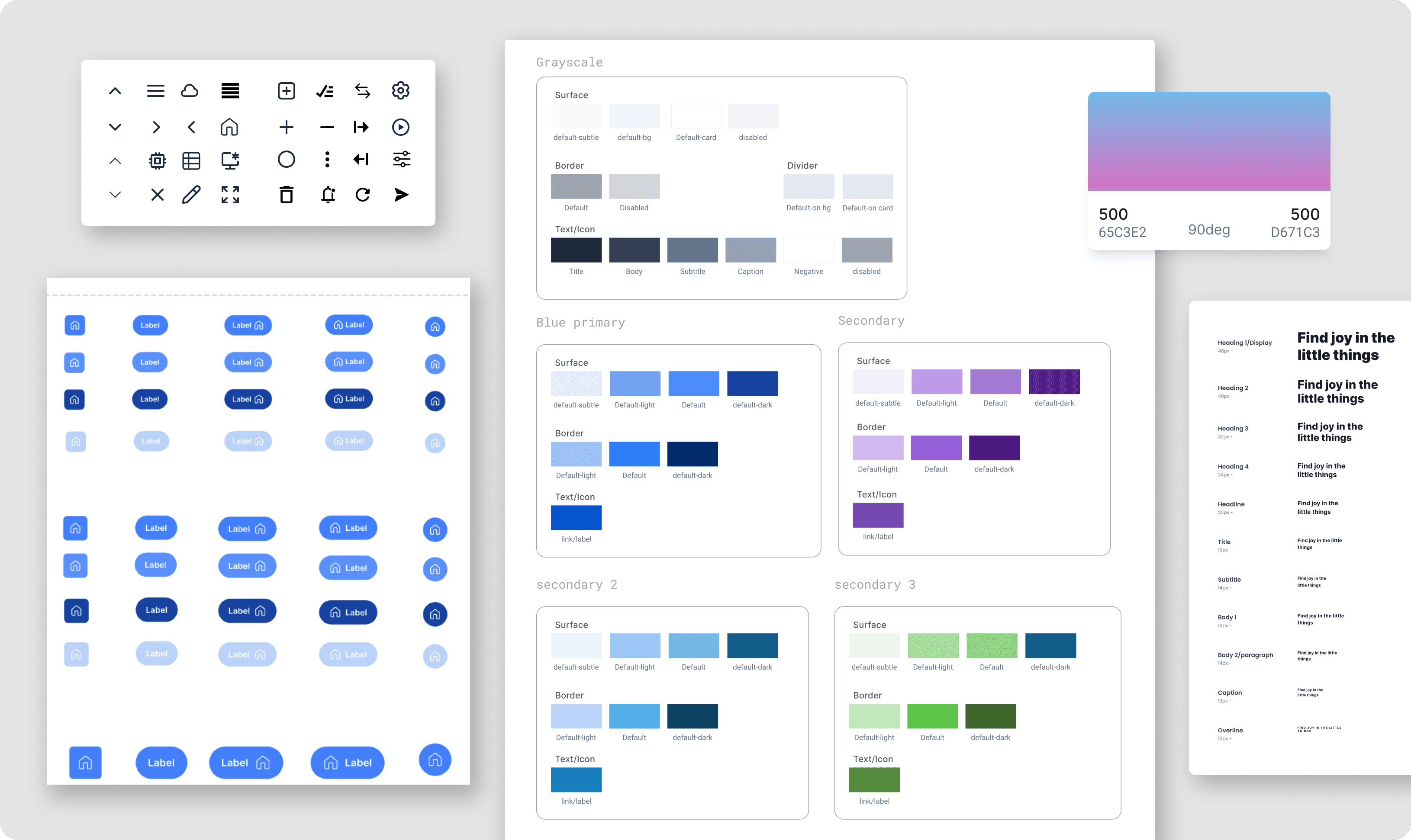
A fragment of ProfitOps’s new design system
A fragment of ProfitOps’s new design system
How might we?
How might we?
After analysing the missing and unwanted detail we worked on how might we improve this UI to address below things:
After analysing the missing and unwanted detail we worked on how might we improve this UI to address below things:

This low-fidelity wireframe solves the "How might we" questions by addressing the details.
This low-fidelity wireframe solves the "How might we" questions by addressing the details.

An example of low-fidelity wireframes
An example of low-fidelity wireframes

Final Version
The redesign process was successful, and now, its looks fresh and bold.
Here is the light and dark mode of screen.
The redesign process was successful, and now, its looks fresh and bold.
Here is the light and dark mode of screen.

Additional features through static screens
Additional features through static screens


What’s next?
What’s next?
Even a successful product has room for improvement because design is a journey, not a destination. We’re continually refining and evolving based on feedback, driven by the spirit to build something even stronger.
Thanks for your time and attention!
Even a successful product has room for improvement because design is a journey, not a destination. We’re continually refining and evolving based on feedback, driven by the spirit to build something even stronger.
Thanks for your time and attention!


